Modernizing Support Resources
This local branch of a global nonprofit wanted to improve their site’s ability to welcome newcomers and increase the site’s utility for existing members.
This local branch of a global nonprofit wanted to improve their site’s ability to welcome newcomers and increase the site’s utility for existing members.
— MY ROLES
UX Writing
Navigation Audit
Copywriting
— GOALS
Streamline user flow
Simplify navigation
Remove outdated content
— TEAM
UX Writer (me)
Web Developer
Nonprofit Board
Website Committee
We considered how to create a path for newcomers to the site and help existing members use the site to connect to online meetings. We focused on broad-ranging content simplifications, from individual site pages to the navigation as a whole.
The tricky part was working within the constraints of the organization’s site template. They wanted to achieve the look of a redesigned site—without a redesign. So we agreed on a site refresh.
This nonprofit uses its website to attract newcomers and inform the general public about support groups and resources, but their site hadn't been updated in years, content was out of date, and buttons were increasing.
We wanted newcomers to be onboarded in just one or two clicks. We wanted return site visitors to quickly get their needs met, too.
I would perform both content and navigation audits—as well as user research—to determine a way forward and streamline content across all site pages.
Impact of the work
Results weren't immediate, but they were notable. Within six weeks, we saw site traffic increases exactly where we wanted them and users flowing along a desired path. This included a clear newcomer path as well as return visitors:
77% increase to key site pages
35% increase in return visitors
48% increase in direct visits
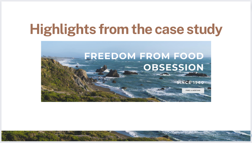
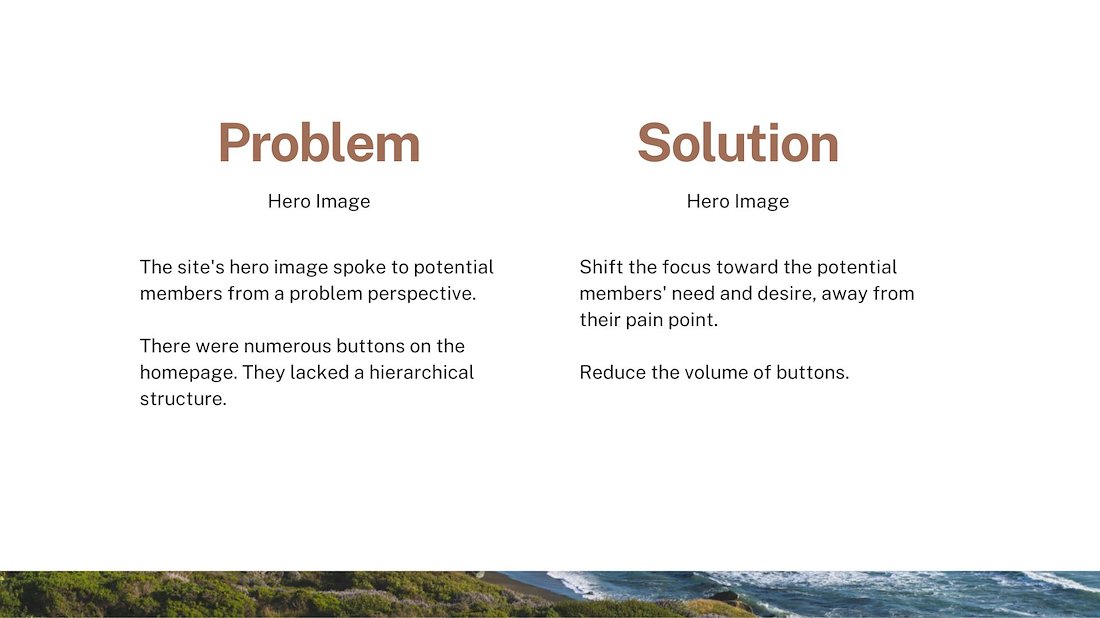
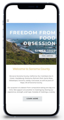
We wanted the hero image to convey reliability and hope with a local vibe.
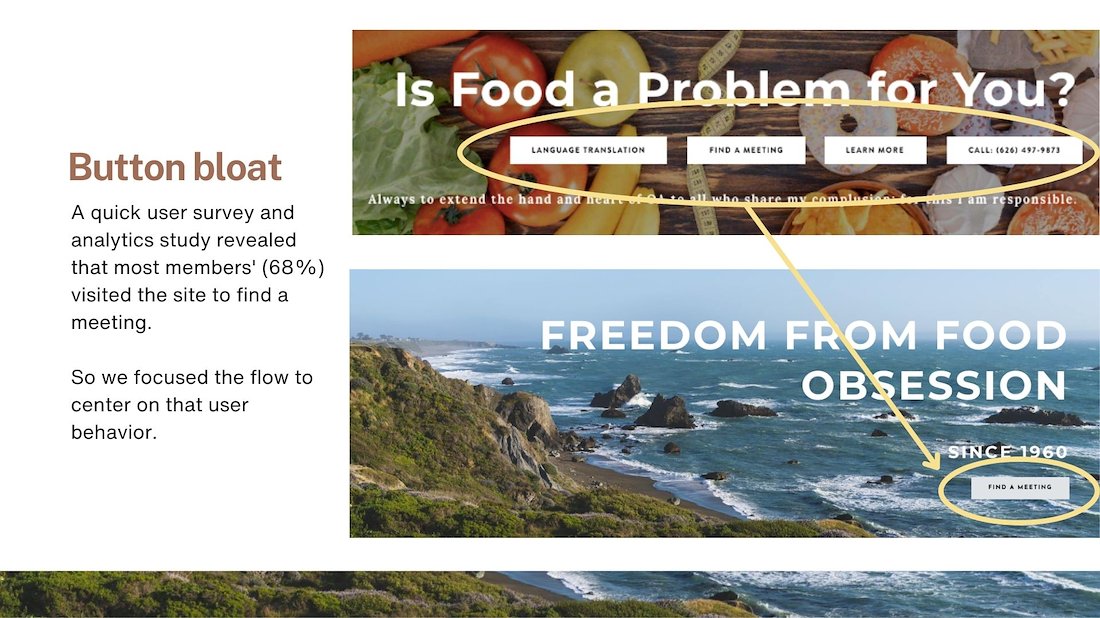
We wanted to reduce cognitive overload by minimizing choices upfront.
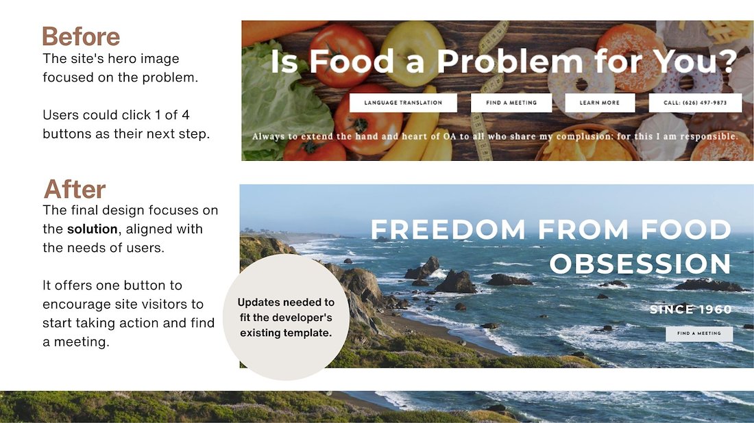
We chose words and imagery that worked with the existing template.
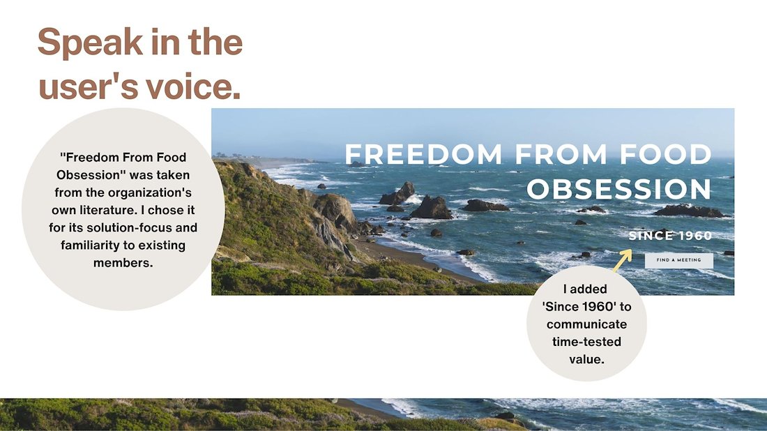
Speaking to users in their own voice was a priority.